
What is the Best Font for Business Cards?
ELEVATE YOUR NETWORKING GAME AND LEAVE A LASTING IMPRESSION
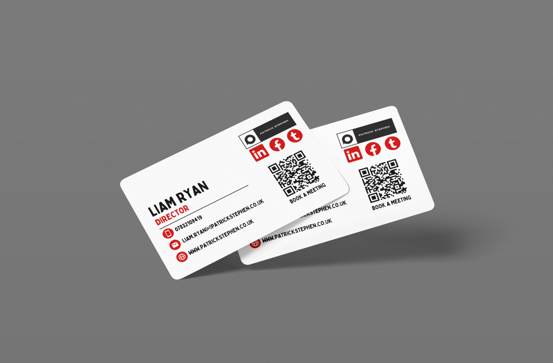
In the world of business, first impressions are vital, and one of the simplest yet most effective ways to make a statement is through your business cards. One crucial element that plays a significant role in how your business card communicates your brand's identity is the font you choose. So, what is the best font for business cards? Let's explore the various factors to consider and recommendations that can help you choose the perfect font.
Importance of Font Selection
Before we dive into specific fonts, it's essential to understand why the font choice matters. Your business card is often a potential client's first interaction with your brand. A well-selected font can convey professionalism, creativity, or friendliness—all depending on the tone you want to set. Therefore, understanding the characteristics of various fonts can help you select one that aligns with your branding goals.
1. Readability is Key
One of the primary factors to consider when choosing a font for business cards is readability. No matter how beautiful or sophisticated a font may look, if it cannot be easily read at a glance, it defeats the purpose of having a business card. The font should be legible in both small print and at any distance.
2. Brand Alignment
Another significant consideration is how the font reflects your brand. For example, a tech startup might opt for a clean and modern sans-serif font to convey innovation, while a law firm may choose a classic serif font to instil trust and authority. The font on your business cards must align with your overall brand image.
Recommended Fonts for Business Cards
Now that we understand the importance of font selection and what to consider, let's delve into some popular fonts that are well-suited for business cards.
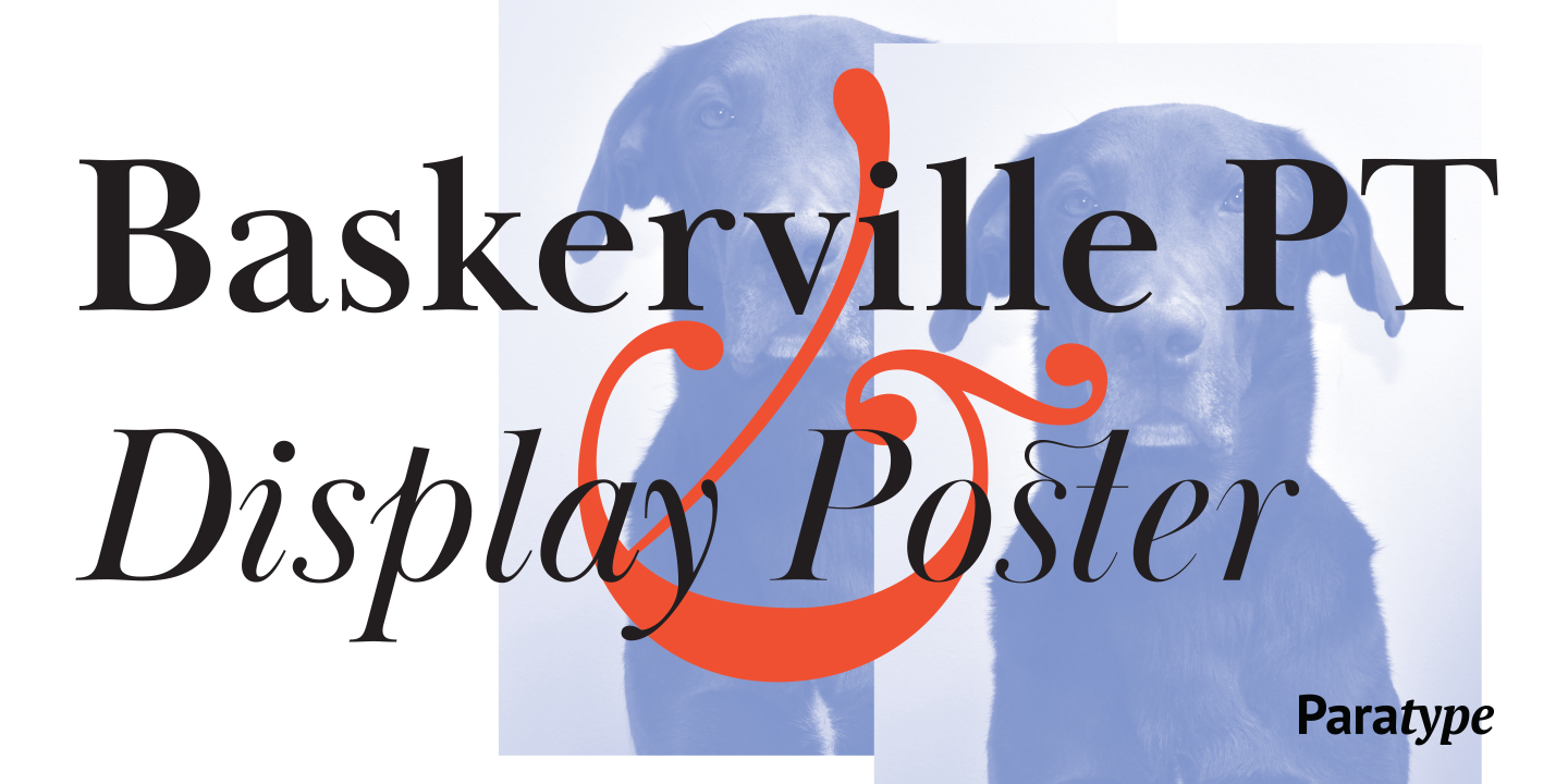
Baskerville PT
Baskerville is a classic serif font that conveys elegance and reliability. It’s an excellent choice for companies looking to project a formal image—perfect for sectors like law, finance, or academia. Its timeless aesthetic can make your business cards stand out while maintaining professionalism.
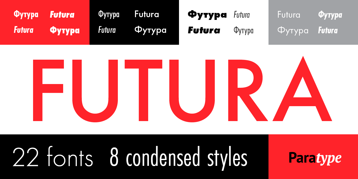
Futura
Futura is characterised by its geometric shapes and modern appeal. This sans-serif font is perfect for creative businesses and industries such as advertising, fashion, or design. Its clean look can lend a contemporary flair to your business cards, making them memorable.
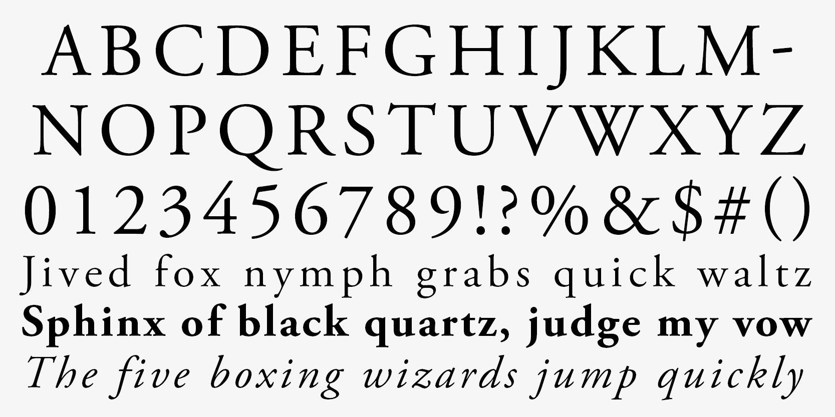
Garamond
Garamond is another classic serif font known for its readability and elegance. It’s a great choice for businesses seeking a text that reflects sophistication and quality. This font can help your business cards exude a polished look that is sure to capture attention.
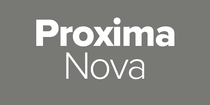
Proxima Nova
Proxima Nova is a versatile, modern sans-serif font that blends traditional sans serif characteristics with a more contemporary feel. This makes it a perfect choice for those who want to straddle the line between formal and modern—ideal for a variety of industries.
Image Credit: Adobe Fonts
Mixing Fonts: A Balanced Approach
While choosing one font is essential, using two can sometimes yield an appealing design. However, it's critical to maintain balance; for example, pair a simple sans-serif font for your name with a more decorative serif font for your title or contact information. This contrast can make your business card visually interesting while maintaining overall coherence.
Font Size and Spacing
As you consider what is the best font for business cards, remember that the size and spacing of the text are just as important. Use a font size that is large enough to be legible while keeping in mind the overall layout of the card. Adequate spacing between lines and elements will also enhance readability and make your business card more aesthetically pleasing.
Final Thoughts
Selecting the right font for your business cards is a crucial step in presenting your brand effectively. Remember to prioritise readability, ensure the font aligns with your brand's image, and consider the overall composition of your card. Fonts like Helvetica, Baskerville, and Futura are excellent starting points. Ultimately, the best font for business cards will be one that resonates with your business's identity while creating a lasting impression on potential clients.
SHARE ON YOUR SOCIALS
Other Posts